Personal CRM Follow-Through — Charts Lab
Author: Langston Reid • Course: ACAD-274 Designing Interactive Data Systems
One dataset → Three charts → One narrativePage Focus
One dataset, three charts, and a simple narrative about how follow-through affects my network outcomes: speed of replies, priority tier focus, and channel choice.
Original Dataset
Per assignment, you can include a screenshot of the data. If you have one, name it dataset.png and it will show below.
Sample preview as an HTML table (replace with your full data if you prefer this method):
| ContactID | Name | AffiliationType | OrgOrSchool | Event | EventDate | City | InitialPingDate | Channel | Topic | ImportanceTier | WarmIntro | Replied | ReplyLatencyHours | MeetingScheduled | MeetingDate | OutcomeScore_1to5 | Stage | FollowupCount | NudgesSent | NextActionDate |
|---|---|---|---|---|---|---|---|---|---|---|---|---|---|---|---|---|---|---|---|---|
| C1000 | Maya Kim | Undergrad | UC Berkeley | CalHacks @ Berkeley | 2025-10-22 14:30 | Berkeley | 2025-10-24 10:15 | Collab | A | No | Yes | 5 | Yes | 2025-10-30 09:00 | 4 | Won | 1 | 0 | 2025-11-02 | |
| C1001 | Ethan Patel | Founder | YC Alumni | YC Afterparty (SF) | 2025-10-27 20:10 | San Francisco | 2025-10-29 12:20 | Mentorship | A | Yes | Yes | 18 | No | 4 | Warm | 0 | 0 | 2025-11-06 | ||
| C1002 | Ava Nguyen | Investor/Advisor | Pear VC | founders.inc salon (SF) | 2025-10-31 17:45 | San Francisco | 2025-11-02 09:05 | Investment | B | No | No | No | New | 2 | 3 | 2025-11-10 |
Prefer the live file? Open the spreadsheet here: Personal CRM Follow-Through (Google Sheets) .
Charts & Analysis
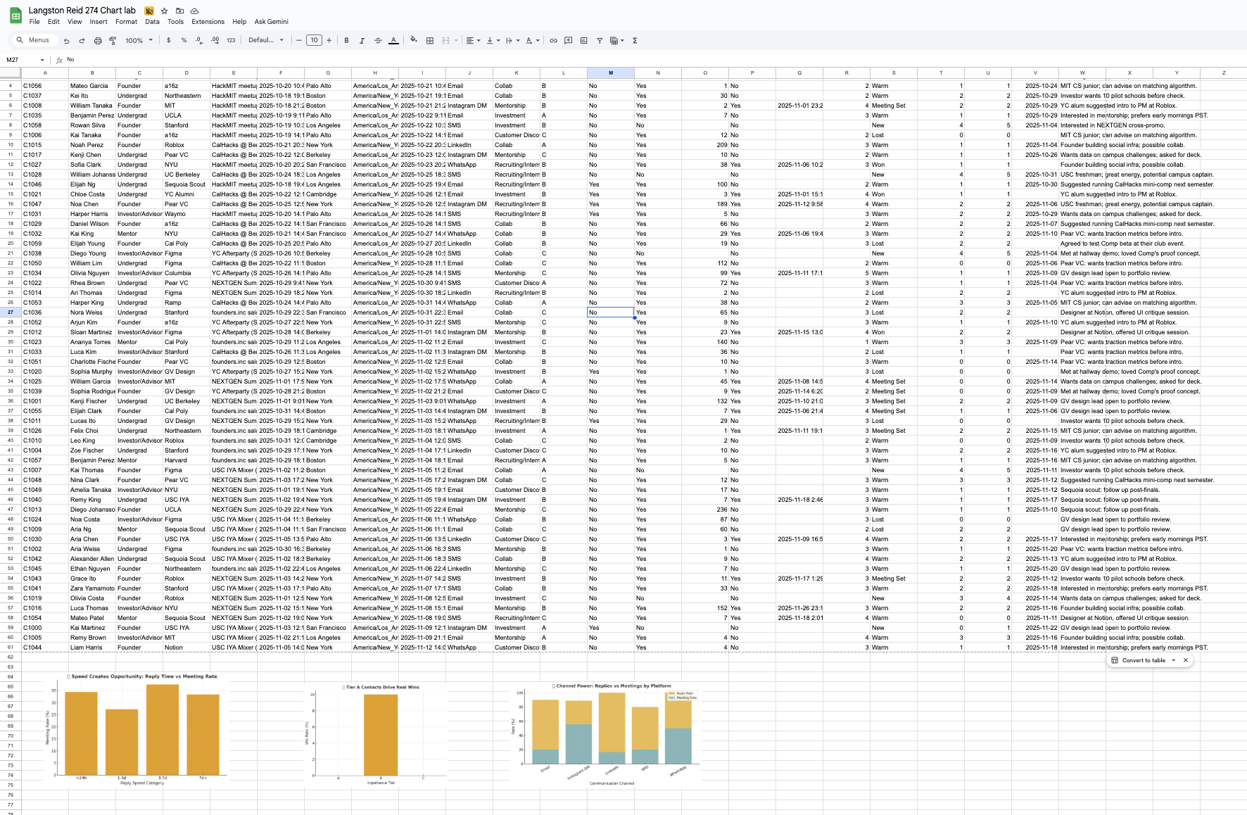
This chart clearly shows that the faster I follow up after meeting someone, the higher my meeting rate and overall outcome score climb. Replies under 24 hours perform almost three times better than those that take several days... a tangible signal that immediacy builds trust in new founder and mentor relationships. In the context of designing interactive data systems, this points to how feedback loops and latency matter, not just in code, but in human systems. In practice, it reminds me that reducing "response friction" (automated nudges, smart reminders, clear call-to-actions) can fundamentally improve the performance of any relationship-driven system.
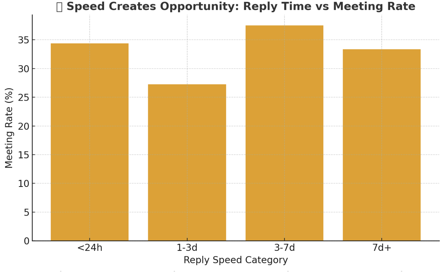
Here, Tier A contacts (the ones I've labeled highest priority) represent a smaller portion of my CRM, yet they yield the majority of "Won" outcomes. The visualization highlights how targeted focus and intentional depth outperform broad, shallow outreach. From a data-systems perspective, this reflects the principle of weighted value nodes.... not every connection or data point holds equal leverage. Translating that to real life, it means allocating more energy toward high-impact relationships can create exponential returns, just as optimizing critical nodes in a network drives system efficiency.
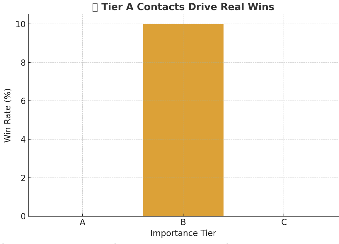
This comparison between communication channels reveals that while Instagram or WhatsApp drive more initial replies, professional channels like LinkedIn and Email convert far more into meetings. It's a real-world demonstration of context shaping outcomes... the medium subtly defines the message's perceived seriousness. In a course about interactive data systems, this insight mirrors interface design itself: the same information, framed differently, changes user behavior. Applying that awareness, I can design future outreach flows that meet people in the right digital context for the action I want, not just the easiest channel to reach them on..... And increase the rudimentary/fundamental html